The world of food processing and packaging equipment is constantly evolving, driven by technological advancements and changing consumer demands. At the heart of this evolution lies the user interface (UI) – the critical point of interaction between human operators and complex machinery. A well-designed UI is not merely about aesthetics; it is a fundamental component of operational efficiency, safety, and productivity. This guide explores the best practices in UI design for this specialized sector, focusing on principles that enhance usability, reduce error, and streamline workflow.
Core Principles of Effective UI Design
The primary goal is to present complex information and control options in an intuitive, clear, and accessible manner.
- Clarity & Simplicity: Avoid clutter. Use clear icons, concise labels, and a logical hierarchy. Every button, indicator, and readout should have an unambiguous purpose.
- Consistency: Maintain uniform design patterns across all screens and machine functions. This reduces learning time and prevents operator confusion.
- Feedback & Responsiveness: The system must provide immediate and clear feedback for every action – be it a button press, parameter change, or alarm condition.
- Error Prevention & Handling: Design should anticipate common mistakes. Use confirmations for critical actions and provide clear, instructive error messages.
Visual Design Elements for Industrial Environments
Industrial environments are often hectic and demanding. The visual design must cater to these conditions.
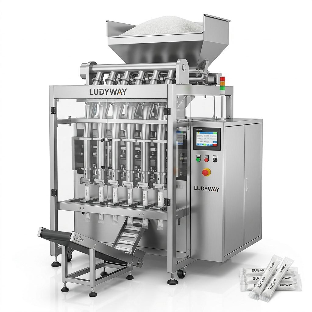
Color Coding: Use color strategically and sparingly. Red for alarms/stops, yellow for warnings, green for normal operation. Avoid overly bright or saturated palettes that can cause fatigue.
Typography: Use high-contrast, sans-serif fonts for readability. Ensure text size is adequate for viewing from a typical operating distance.
Iconography: Employ standardized, familiar symbols (e.g., play, stop, settings). Custom icons should be simple and tested for operator comprehension.
Layout & Information Hierarchy
The screen layout should guide the operator’s eye naturally through the workflow.
Group related functions and information spatially. Primary controls and key status indicators (like machine state or production count) should occupy prominent, fixed positions. Secondary settings and diagnostic information can be accessed via nested menus or dedicated screens, keeping the main interface clean.
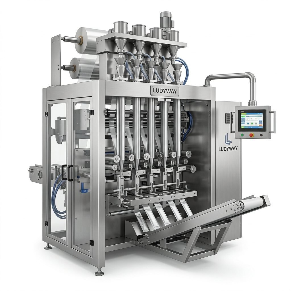
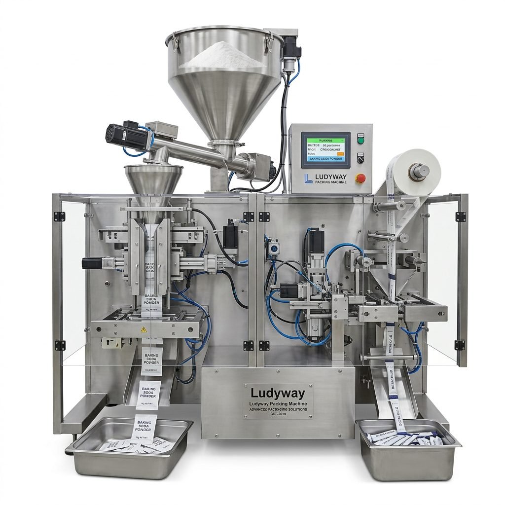
Interaction Design: Touchscreens, Buttons, and Navigation
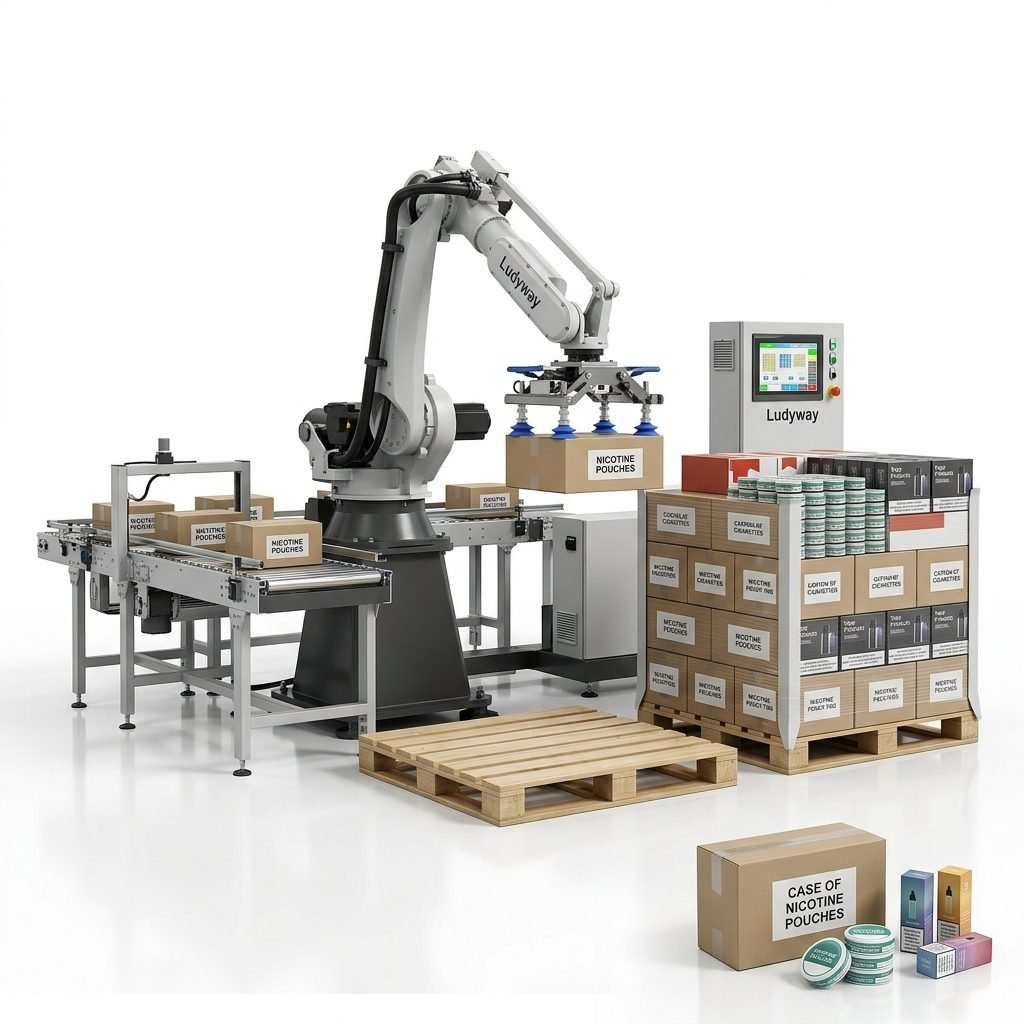
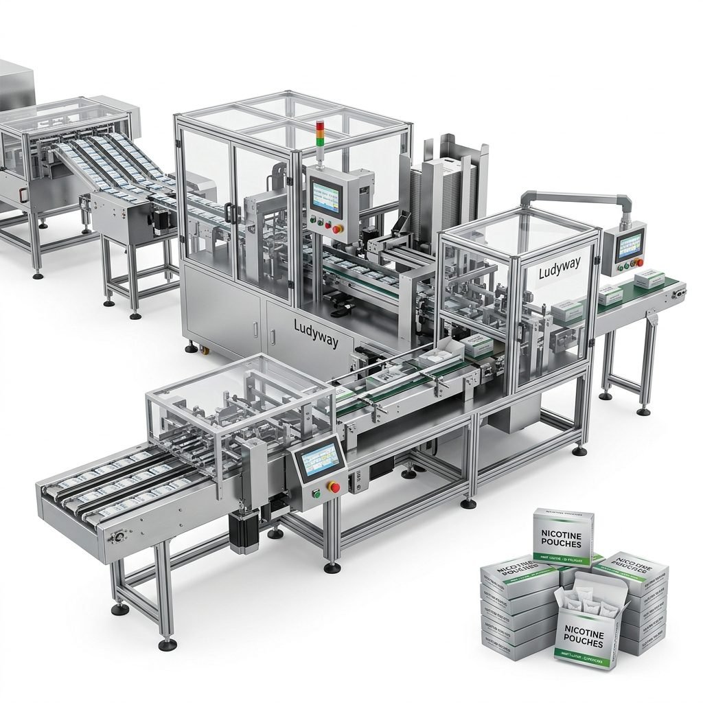
With the prevalence of touchscreen HMIs (Human-Machine Interfaces), interaction design is paramount.
Touch Target Size: Buttons and touch areas must be large enough for reliable interaction, even in environments where operators might wear gloves or have wet hands.
Navigation Flow: Create a linear, predictable navigation path. Avoid deep or complex menu structures. “Back” or “Home” functions should always be readily available.
Physical Button Integration: For critical emergency functions (like E-stop), dedicated physical buttons are often preferable to touchscreen controls.
Adapting to Global Operator Demographics
Food processing plants operate worldwide, with diverse operator backgrounds. UI design must consider localization.
Support for multiple languages is essential. Beyond simple text translation, consider cultural norms in icon meaning and color perception. For instance, in some regions, certain colors may carry specific connotations unrelated to machinery. The layout should also accommodate potential differences in average operator height or preferred viewing angle.
Implementing a well-designed UI requires close collaboration between engineers, designers, and end-users. Prototyping and usability testing with actual operators in simulated or real environments is crucial to uncover issues and refine the design.
Benefits of Superior UI Design
Investing in a thoughtful UI yields significant returns:
- Reduced Training Time & Costs: Intuitive interfaces are learned faster.
- Lower Operational Error Rates: Clear design prevents mistakes, reducing waste and downtime.
- Increased Productivity: Efficient workflows and quick access to information speed up changeovers and production.
- Enhanced Safety: Immediate, clear feedback on machine status and alarms helps prevent accidents.
- Improved Operator Satisfaction: A good UI reduces frustration and stress, leading to a more engaged workforce.
Ultimately, the best user interface for food processing and packaging equipment is one that disappears into the background, allowing the operator to focus on the task, not the tool. It empowers the user, enhances the machine’s capabilities, and contributes directly to a safer, more efficient, and more profitable operation.
Frequently Asked Questions
Q1: Is a touchscreen always better than physical buttons for packaging equipment?
Not always. Touchscreens offer flexibility and space efficiency, but for critical emergency stops (E-stop) or frequently used functions in harsh environments (wet, greasy), dedicated physical buttons can be more reliable and faster to actuate. A hybrid approach is often optimal.
Q2: How important is multilingual support in the UI?
It is very important for global equipment suppliers. Beyond basic translation, consider cultural nuances in symbols and colors. It facilitates easier training and operation in local markets and is a key factor for international manufacturers.
Q3: What is the biggest mistake in industrial UI design?
Overcomplication. Adding too many features, indicators, or controls onto a single screen leads to operator confusion and error. Prioritize information and adhere to the principle of simplicity. Understanding the core operational workflow is essential.
Q4: How can we test the UI design before final implementation?
Create interactive prototypes (using software simulators or simple mock-ups) and conduct usability tests with representative operators. Observe their interactions, ask for feedback, and measure task completion times and error rates. This iterative process is vital for a successful design, much like the iterative development of the machinery itself.
Q5: Does good UI design require a large budget?
Not necessarily. While sophisticated graphical interfaces can be costly, many core principles (clarity, consistency, good layout) can be implemented effectively within standard HMI development frameworks. The focus should be on user-centered design thinking, not just graphical extravagance.